Heat map style visualize of index values
我想用一个色标来可视化/绘制数据,代表 GIC.Fish 和 GIC 中的值。按 Dive.Number 缩放列。这有点像相关矩阵或热图,除了 Fish 和 Zoop 值彼此不相关,而是与潜水次数相关。以下数据是数据帧”temp”。
|
1
2 3 4 5 6 7 8 9 10 11 12 13 14 15 16 17 18 19 20 21 22 23 24 25 26 27 28 29 30 31 32 33 34 35 36 37 |
Dive.Number GIC.Fish GIC.Zoop
[1,] 1 0.83 0.37 [2,] 2 0.88 0.41 [3,] 3 0.98 0.57 [4,] 4 0.90 0.43 [5,] 5 1.00 0.58 [6,] 6 0.92 0.44 [7,] 7 0.71 0.33 [8,] 8 0.99 0.55 [9,] 9 0.94 0.47 [10,] 10 0.95 0.48 [11,] 11 0.91 0.44 [12,] 12 0.96 0.50 [13,] 13 0.86 0.39 [14,] 14 0.94 0.47 [15,] 15 0.91 0.43 [16,] 16 0.89 0.41 [17,] 17 0.92 0.45 [18,] 18 0.94 0.47 [19,] 19 1.00 0.59 [20,] 20 0.96 0.53 [21,] 21 0.96 0.52 [22,] 22 1.00 0.68 [23,] 23 0.99 0.73 [24,] 24 0.98 0.77 [25,] 25 0.96 0.80 [26,] 26 0.83 0.98 [27,] 27 0.72 1.00 [28,] 28 0.98 0.77 [29,] 29 0.44 0.73 [30,] 30 0.29 0.44 [31,] 31 0.31 0.48 [32,] 32 0.64 0.97 [33,] 33 0.08 0.04 [34,] 34 0.09 0.05 [35,] 35 0.61 0.96 [36,] 36 0.36 0.59 |
这段代码让我有点接近,但只有一列相关数据。
|
1
2 3 4 |
p<-ggplot(temp, aes(x=GIC.Fish, y=Dive.Number, fill=GIC.Fish))+
geom_tile() + scale_fill_gradient2(midpoint=.5, low=”blue”, high=”red”) + guides(fill=FALSE) |
这让我更接近了,但我不想要 Dive Number 列,也不想在单元格中显示实际值,我希望能够更改颜色栏中的颜色。
|
1
2 3 4 5 6 |
setInternet2(TRUE)
con = gzcon(url(‘http://www.systematicportfolio.com/sit.gz’, ‘rb’)) source(con) close(con) as.matrix(temp) plot.table(temp, highlight=TRUE, colorbar=TRUE) |
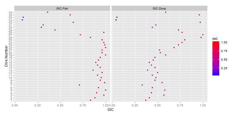
- 你能试着描述一下这个情节会是什么样子吗?每个轴上有什么,颜色代表什么?
- 我希望鱼和 Zoop 值的 x 轴(几乎像两列或框架)和 y 轴是潜水数。颜色用于表示 Fish and Zoop 中的值,范围从蓝色(值为零)到红色(值 1)。这有帮助吗?
这是你所追求的吗?假设您的数据是 dat:
|
1
2 3 4 5 6 7 8 |
dat$Dive.Number <- factor(dat$Dive.Number)
library(reshape2) dat.m <- melt(dat, variable.name =”GIC.type”, value.name =”GIC”) p <- ggplot(dat.m, aes(GIC, Dive.Number)) + geom_point(aes(colour = GIC)) + |
来源:https://www.codenong.com/17414826/