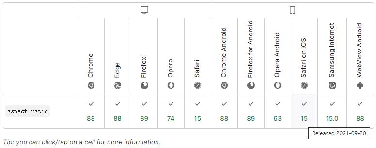
aspect-ratio属性文档可以到 MDN 查看,下图是浏览器支持情况,可以看到现代浏览器全部都支持这个属性了。
aspect-ratio 的语法格式如下:aspect-ratio: <width-ratio>/<height-ratio> (/ 前后都是大于0的数字,后面数字为1时可以省略)
aspect-ratio 属性值也可以设置为 auto,相当于是默认值,这样对于图片、视频这样有原始纵横比的替换元素,就会保持原始比例,示例代码如下:
<div class="container">
    <div class="img-wrap">
      <img src="https://www.02405.com/wp-content/uploads/2023/04/blog-aspect-ratios-2x.webp" alt="cover">
    </div>
</div>
<style>
*, *::before, *::after{
  margin: 0;
  padding: 0;
  /* box-sizing: border-box; */
}

body {
  display: flex;
  height: 100vh;
  justify-content: center;
  align-items: center;
}

.container {
  width: 320px;
  background: #ffaabb50;
  height: 400px;
}

.img-wrap {
  width: 100%;
  height: auto;
  aspect-ratio: 16/10;
}

.img-wrap img {
  width: 100%;
  height: 100%;
  object-fit: cover;
}
</style>
(adsbygoogle = window.adsbygoogle || []).push({});
来源:https://www.02405.com/archives/9341